JUSTIN’S
Retail Strategy
Packaging Design
Illustration
Line Extension
Typography
Retail Strategy Packaging Design Illustration Line Extension Typography
Caution: Definitely
Contains Nuts.
In 2009, Justin’s (a company of 3) had a serious problem; they looked identical to every other natural food on-shelf.
There was a major opportunity to re-write the rules of natural health – earth tones and green-washed packaging was replaced with a clean, white, ingredient-championed identity.

Not all heroes wear capes.
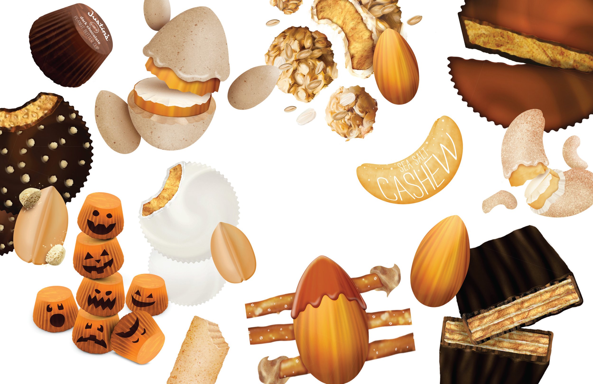
Nuts are at the center of everything Justin’s does, so who better to put front and center?
I illustrated each nut, with the corresponding flavor cues, and overlayed a thin white hand-done type to denote each SKU.
The result was an impactful brand-blocked shelf that is impossible to ignore.
The Justin’s aesthetic has been carried through various product innovations, and continues to fuel growth for the once tiny, garage-born brand.


